IMAGE · 1FORMAT:
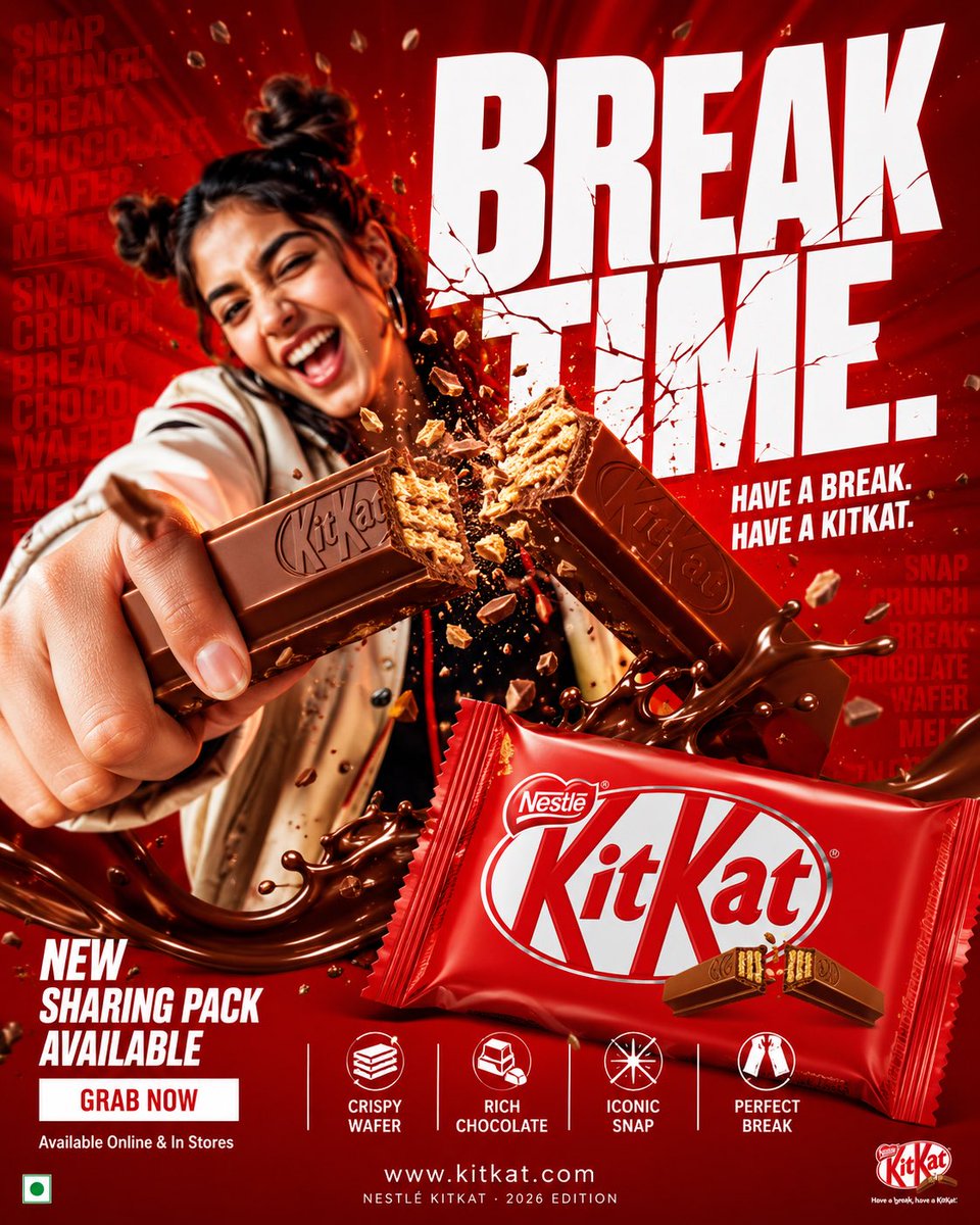
4:5 vertical hyper-commercial chocolate campaign poster, ultra-high resolution (8K), premium billboard + social media advertising ready
Style: bold FMCG advertising × modern snack campaign × energetic commercial poster design × high-impact product photography
🧠 CORE IDEA:
THE BREAK EVERYONE WAITS FOR.
A campaign built around
impact,
craving,
and satisfying motion.
Everything in the composition reacts
to the iconic KitKat snap.
🎬 MASTER COMPOSITION:
BACKGROUND:
Deep KitKat red environment
Layered with:
- rich red gradients
- chocolate texture overlays
- dynamic motion streaks
- subtle crumb particles
- repeated typography patterns
- glossy studio reflections
The atmosphere should feel:
bold,
hungry,
energetic,
commercially explosive.
👤 HUMAN SUBJECT:
Young Gen-Z male/female model
Expression:
playful,
confident,
mid-enjoyment moment
Pose:
holding KitKat toward camera
mid-snap action
Camera angle:
slightly low + close perspective
for product dominance
Wardrobe:
modern streetwear in neutral tones
allowing red palette to dominate
💥 VISUAL ENERGY:
The SNAP becomes the visual explosion.
At the break point:
- chocolate shards flying outward
- wafer crumbs suspended mid-air
- liquid chocolate streaks
- motion lines radiating from snap
Typography physically cracks apart
following the KitKat break.
Feels:
satisfying,
punchy,
commercially exaggerated.
🍫 PRODUCT HERO:
[KitKat](chatgpt://generic-entity?number=0) chocolate bar + wrapper
Placement:
foreground center-right
Angle:
extreme 3/4 hero perspective
Product details:
- hyper-real chocolate texture
- visible wafer layers
- glossy melted chocolate highlights
- realistic crumbs
- embossed KitKat logo
- premium wrapper reflections
Chocolate should feel:
crispy,
rich,
irresistible.
✍️ TYPOGRAPHY SYSTEM:
MAIN HEADLINE:
“BREAK
TIME.”
Typography style:
- ultra-bold condensed sans-serif
- oversized stacked layout
- white typography
- extremely tight spacing
- cracked/distorted around snap point
SECONDARY TEXT:
“HAVE A BREAK. HAVE A KITKAT.”
BACKGROUND TYPOGRAPHY:
Repeated low-opacity words:
SNAP
CRUNCH
BREAK
CHOCOLATE
WAFER
MELT
integrated into background layers
📦 FEATURE INFORMATION STRIP:
Bottom premium feature strip:
□ CRISPY WAFER
□ RICH CHOCOLATE
□ ICONIC SNAP
□ PERFECT BREAK
Minimal modern icon system.
📣 CTA SECTION:
BOTTOM LEFT:
“NEW SHARING PACK AVAILABLE”
CTA BUTTON:
solid white rectangular button
TEXT:
“GRAB NOW”
Secondary micro CTA:
“Available Online & In Stores”
🌐 WEBSITE + BRAND INFO:
BOTTOM CENTER:
www.kitkat
BOTTOM MICROTEXT:
“NESTLÉ KITKAT · 2026 EDITION”
🎨 COLOR SYSTEM:
PRIMARY:
KitKat red
deep chocolate brown
SECONDARY:
white typography
ACCENTS:
warm chocolate highlights
golden wafer tones
Palette should feel:
bold,
delicious,
high-energy,
commercial.
💡 LIGHTING SYSTEM:
MAIN LIGHT:
strong commercial studio key light
RIM LIGHT:
warm chocolate highlights around product
ACCENT LIGHT:
soft red glow behind snap motion
ATMOSPHERIC LIGHT:
subtle floating particles catching light
REFLECTIONS:
glossy FMCG-grade reflections
Lighting should feel:
premium snack advertising × modern commercial photography.
✨ HYPER DETAILING:
- ultra-real wafer texture
- sharp chocolate break detail
- floating crumb realism
- melted chocolate reflections
- premium wrapper texture
- billboard readability maintained
- ultra-clean typography edges
- high-end FMCG rendering quality
📐 COMPOSITION FLOW:
Upper Frame:
massive typography dominance
Center:
snap explosion + human interaction
Foreground:
product hero
Lower-left:
CTA + features
Eye flow:
Headline → Snap → Product → Chocolate Motion → CTA
🎥 CAMERA & RENDER:
- commercial food photography
- Phase One medium format feel
- 35–50mm lens
- HDR commercial rendering
- ultra-clean sharpness
- premium FMCG color grading
🔥 FINAL FEEL:
Feels like:
Nike energy campaign × premium FMCG launch × modern Behance commercial food poster.
SUMMARYFORMAT: 4:5 vertical hyper-commercial chocolate campaign poster, ultra-high resolution (8K), premium billboard + social media advertising ready Style: bold FMCG advertising × moder